

1.MIUI Widget布局自适应方案建议及示例
1.1.概述
背景见:《MIUI小部件技术规范与系统能力说明》中「小部件技术规范和要求」第八项。
本模块介绍了常用的几类Widget布局实现自适应的方案。
1.2.方案与示例
1.2.1.快捷卡片的自适应方案实践
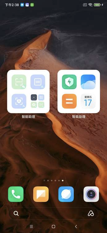

快捷功能卡片中每个icon的大小是固定的,但是在widget中无法获取具体显示大小,因此如果只写死一套尺寸,在某些模式下,icon会显示不全。
目前采用的方案是,使用2套布局资源,在布局中写死大小,根据Google小部件开发指南中提到的,使用OPTION_APPWIDGET_MIN_WIDTH或者OPTION_APPWIDGET_MAX_WIDTH返回的数值决定使用哪套布局:
先定义2套不同尺寸的layout资源:
//layout_shortcut_large
<?xml version="1.0" encoding="utf-8"?>
<LinearLayout xmlns:android="http://schemas.android.com/apk/res/android"
    android:layout_width="match_parent"
    android:layout_height="wrap_content"
    android:orientation="vertical">

    <ImageView
        android:id="@+id/shortcut_icon"
        android:layout_width="53dp"
        android:layout_height="53dp"
        android:layout_gravity="center"
        android:scaleType="centerCrop" />

    <TextView
        android:id="@+id/shortcut_name"
        android:layout_width="wrap_content"
        android:layout_height="wrap_content"
        android:layout_gravity="center"
        android:layout_marginTop="@dimen/dp_4"
        android:textSize="24sp" />
</LinearLayout>


//layout_shortcut_small
<?xml version="1.0" encoding="utf-8"?>
<LinearLayout xmlns:android="http://schemas.android.com/apk/res/android"
    android:layout_width="match_parent"
    android:layout_height="wrap_content"
    android:orientation="vertical">

    <ImageView
        android:id="@+id/shortcut_icon"
        android:layout_width="28dp"
        android:layout_height="28dp"
        android:layout_gravity="center"
        android:scaleType="centerCrop" />

    <TextView
        android:id="@+id/shortcut_name"
        android:layout_width="wrap_content"
        android:layout_height="wrap_content"
        android:layout_gravity="center"
        android:layout_marginTop="@dimen/dp_4"
        android:textSize="14sp"/>
</LinearLayout>
在代码中动态判断使用哪一套布局:
class SimpleWidgetProvider : AppWidgetProvider() {

    override fun onUpdate(
    context: Context,
    appWidgetManager: AppWidgetManager,
    appWidgetIds: IntArray) {
        appWidgetIds.forEach { appWidgetId ->
        updateAppWidget(context, appWidgetManager, appWidgetId)
        }
    }

    fun updateAppWidget(
        context: Context,
        appWidgetManager: AppWidgetManager,
        appWidgetId: Int,
    ) {
        val appWidgetManager = AppWidgetManager.getInstance(context)
        val options = appWidgetManager.getAppWidgetOptions(appWidgetId)
        if (options == null) {
            return null
        }
        val minWidth = options.getInt(AppWidgetManager.OPTION_APPWIDGET_MIN_WIDTH)
        val widgetLayoutRes = if (minWidth >= 300)R.layout.layout_shortcut_large else R.layout.layout_shortcut_small
        val remoteViews = RemoteViews(context.packageName, widgetLayoutRes)
        appWidgetManager.updateAppWidget(appWidgetId, remoteViews)
    }

    /**
     * 任何option的更改都会触发,无法通过newOptions来判断是否是大小发生了变化
     * 需要将本次的MAX_HEIGHT/MAX_WIDHT记录下来,在下一次触发时比对
     */
    @CallSuper
    override fun onAppWidgetOptionsChanged(
        context: Context,
        appWidgetManager: AppWidgetManager,
        appWidgetId: Int,
        newOptions: Bundle
    ) {
        //需要在options change通知里判断,min和max是否发生了变化,如果发生了变化,需要更新布局
    }
}
1.2.2.股票卡片的自适应方案实践
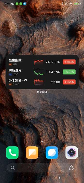
RemoteViews无法动态设置宽高,但是可以在布局中设置宽高,为了实现卡片的自适应,我们不建议在布局中给layout_width和layout_height设置固定值,但是可以通过设置最大和最小宽高来达到自适应的效果;
例如股票通过调整ListView中每个item的maxHeight和maxHeight,来实现自适应(以下按1080*2340分辨率为例):
<?xml version="1.0" encoding="utf-8"?>
<RelativeLayout xmlns:android="http://schemas.android.com/apk/res/android"
    android:id="@+id/stock_item"
    android:layout_width="match_parent"
    android:layout_height="wrap_content"
    android:maxHeight="43.64dp"
    android:minHeight="40.97dp"
    android:background="@drawable/pa_bg_stock_widget_item"
    android:paddingHorizontal="@dimen/dp_7">

    <include layout="@layout/pa_widget_stock_item" />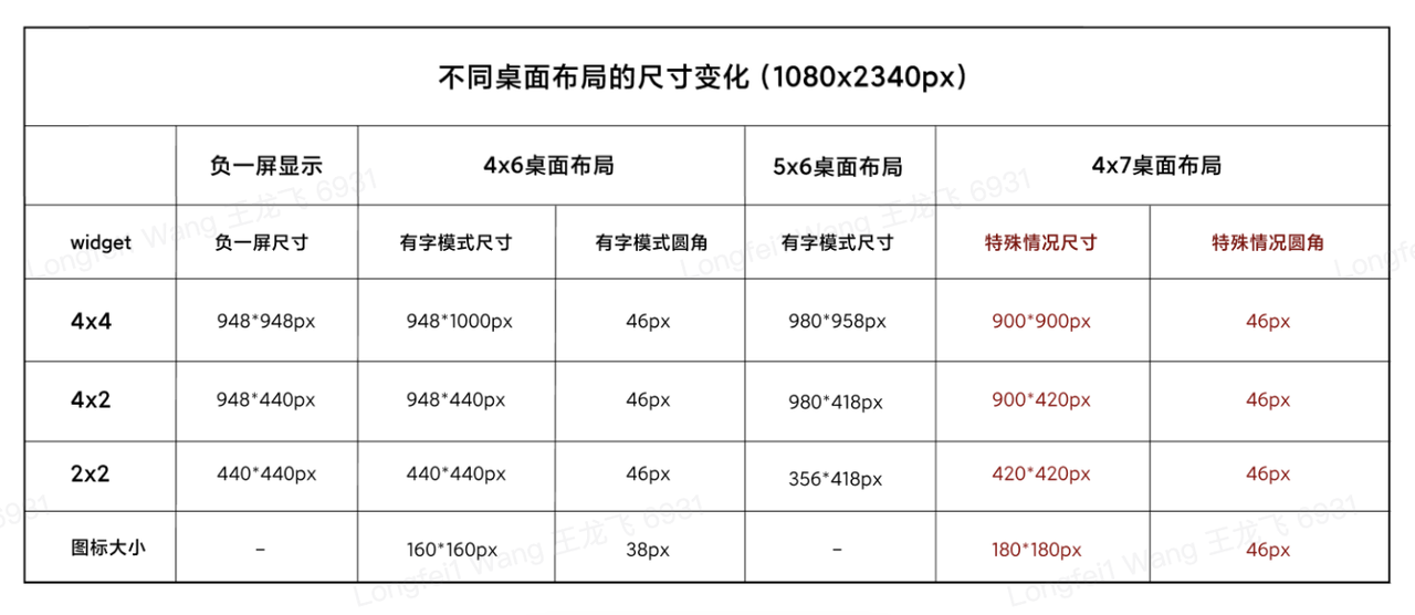
</RelativeLayout>- android:minHeight计算:(418-40*2)/ 3 / 2.75=40.97
- android:maxHeight计算:(440-40*2)/ 3/ 2.75 = 43.64
计算过程:
在MIUI小部件设计规范中,列出了Widget Host在不同模式下的尺寸:
如表格所示,4*2规格的卡片,其最小显示高度是418px,最大显示高度是440px,我们要求内容区距离卡片外边距最小是40px,因此,对于4*2widget的内容区的最小显示高度为418-40*2;
股票4*2最多显示3条数据,因此每条数据的最小显示高度为(418-40*2)/ 3,换算成dp为40.97dp;最大显示高度类似;
1.2.3.其他方案建议
使用LinearLayout等分布局:
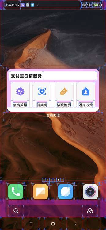
疫情卡片的一种自适应布局实现:
<?xml version="1.0" encoding="utf-8"?>
<FrameLayout xmlns:android="http://schemas.android.com/apk/res/android"
    android:layout_width="match_parent"
    android:layout_height="match_parent"
    android:padding="40px">

    <TextView
        android:id="@+id/title"
        android:layout_width="match_parent"
        android:layout_height="wrap_content" />

    <LinearLayout
        android:layout_width="match_parent"
        android:layout_height="wrap_content"
        android:orientation="horizontal"
        android:layout_gravity="bottom">

        <LinearLayout
            android:id="@+id/item1"
            android:layout_width="0dp"
            android:layout_height="100dp"
            android:layout_marginEnd="10dp"
            android:layout_weight="1">

        </LinearLayout>

        <LinearLayout
            android:id="@+id/item2"
            android:layout_width="0dp"
            android:layout_height="100dp"
            android:layout_marginEnd="10dp"
            android:layout_weight="1">

        </LinearLayout>

        <LinearLayout
            android:id="@+id/item3"
            android:layout_width="0dp"
            android:layout_height="100dp"
            android:layout_marginEnd="10dp"
            android:layout_weight="1">

        </LinearLayout>

        <LinearLayout
            android:id="@+id/item4"
            android:layout_width="0dp"
            android:layout_height="100dp"
            android:layout_weight="1">

        </LinearLayout>
    </LinearLayout>

</FrameLayout>
利用LinearLayout的android:layout_height属性,动态分配每个item的尺寸;
注:股票卡片也可以采用该方案进行适配,事实上,所有使用ListView或者GridView的卡片布局,都可以用该方案代替,来达到自适应效果,但是相应地需要进行更多自定义的封装,开发成本更高,但是效果比较理想;
使用RelativeLayout相对布局:
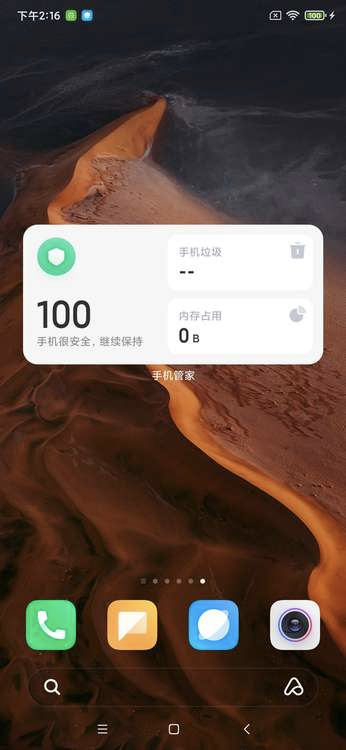
手机管理卡片的一种自适应布局实现:
<?xml version="1.0" encoding="utf-8"?>
<LinearLayout xmlns:android="http://schemas.android.com/apk/res/android"
    android:layout_width="match_parent"
    android:layout_height="match_parent"
    android:orientation="horizontal"
    android:padding="40px">

    <RelativeLayout
        android:layout_width="0dp"
        android:layout_height="match_parent"
        android:layout_weight="1">

        <ImageView
            android:id="@+id/icon"
            android:layout_width="wrap_content"
            android:layout_height="wrap_content" />

        <TextView
            android:id="@+id/score_description"
            android:layout_width="wrap_content"
            android:layout_height="wrap_content"
            android:layout_alignParentStart="true"
            android:layout_alignParentBottom="true"
            android:text="手机很安全,继续保持"/>

        <TextView
            android:id="@+id/score"
            android:layout_width="wrap_content"
            android:layout_height="wrap_content"
            android:text="100"/>
    </RelativeLayout>


    <LinearLayout
        android:layout_width="0dp"
        android:layout_height="match_parent"
        android:layout_weight="1"
        android:orientation="vertical">

        <TextView
            android:layout_width="match_parent"
            android:layout_height="0dp"
            android:layout_weight="1"
            android:text="手机垃圾"/>

        <TextView
            android:layout_width="match_parent"
            android:layout_height="0dp"
            android:layout_weight="1"
            android:text="内存占用"/>
    </LinearLayout>

</LinearLayout>
1.3.总结
- 以上各个方案只是目前为止,可能的部分自适应实践建议,业务需要根据自身情况来判断如何适配
- 以上各个方案,部分方案可以通过组合的方式,来实现更多效果
- 以上示例代码中的数值和布局,只具有演示效果,业务需要根据具体情况调整,请勿原样复制
2.小部件加载态建议及示例
2.1.概述
背景见:《MIUI小部件规范》中「无内容场景」。没有配置加载态手机重启或者桌面/负一屏重启会呈现空白卡片,影响整体体验,本模块介绍了推荐的加载态实现方案。
2.2.方案
默认展示加载态(initialLayout指定加载态布局资源),当收到update广播时更新为实际的布局
# 工程结构
.
└── src
    ├── main
    │   └── java
    └── res
        ├── drawable
        │   └── loading.webp
        ├── drawable-night
        │   └── loading.webp
        ├── layout
        │   ├── layout_example.xml
        │   └── layout_loading.xml
        └── xml
            └── app_widget_simple.xml
layout_example.xml 正常的布局资源
...
layout_loading.xml 加载态布局资源
<ImageView xmlns:android="http://schemas.android.com/apk/res/android"
    android:layout_width="match_parent"
    android:layout_height="match_parent"
    android:scaleType="fitXY"
android:src="@drawable/loading.webp" />app_widget_simple.xml 小部件配置资源
<appwidget-provider xmlns:android="http://schemas.android.com/apk/res/android"
    android:minWidth="xxx"
    android:minHeight="xxx"
    ...
    android:initialLayout="@layout/layout_loading.xml"/>
AppWidgetProvider 使用正常布局文件创建RemoteViews
public class ExampleWidget extends AppWidgetProvider {

    @Override
    public void onUpdate(Context context, AppWidgetManager appWidgetManager, int[] appWidgetIds) {
        super.onUpdate(context, appWidgetManager, appWidgetIds);
        for (int appWidgetId : appWidgetIds) {
            // 正常布局文件创建RemoteViews
            RemoteViews remoteViews = new RemoteViews(context.getPackageName(),
            R.layout.example);
            ...
        }
    }
}
备注:以上方案仅做参考。
编辑:yimen,如若转载,请注明出处:https://www.yimenapp.com/kb-yimen/12419/
部分内容来自网络投稿,如有侵权联系立删